IdeaShare Coaching Blog

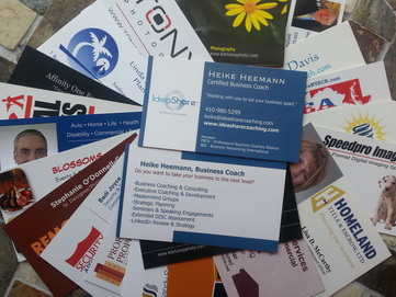 Your business card is one of the cheapest pieces of marketing material available to you. It is a means to share your contact information and so much more. It can create an impression, serve as a reminder of what you do and carry notes that the recipient jotted down during your meeting.
Keeping all this in perspective, there are two users for your card: You and the recipient. Unfortunately some of the recipient's needs in a practical business cards are often forgotten during the design process. Many of the business card mistakes listed below have to do with legibility from font style to font size or background color. However, there are a lot of other things that can go wrong in card design. Make use of your business card properly to ensure it is read, kept or potentially even passed on to someone who might be interested in your product or services. Here is a count-down list of mistakes I see on a regular basis that impact potential follow up after meeting someone. 16.) Cheap paper stock or perforated tear off cards from the office supply store. You don't have to break the bank on the paper stock but don't go with something that is too close to printer paper either. 15.) Extra thick card stock. This makes it difficult for those that would actually be happy with taking several of your cards to pass on to their connections to store these in business card binders, or other storage options designed for these cards. BNI (Business Networking International) members know what I'm talking about. 14.) A vertical layout. Though you may not be one of them, there are still millions of business people who keep the business cards they receive in binders or special business card storage sleeves. All of them are in a horizontal format. By having a vertical card, you make your information more difficult to read and therefore easy to skip over. 13.) Unusual card sizes or formats: extra large, extra small, round, etc. Stick with a standard card size for your country. If you make it difficult for people to fit your card into their standard filing system, your information is more likely to be discarded. 12.) Insufficient contrast between font and background or a plastic see-through card. Make legibility a key design choice. If the text doesn't stand out because of the background of the card itself or because you can see something else through it, you are again making it hard for the reader. 11.) Using glossy paper stock that a standard ball point pen cannot write on. Though glossy stock - to some - may make the card look classier, glossy stock can also reduce the usability of the card for the recipient. If they can't write anything on it, key information about your conversation may be lost. Most people don't travel with a Sharpie, which is in most cases what's needed to write on glossy stock. Glossy stock can also make it more difficult to get an accurate image for the electronic card reading software apps now available through various companies (e.g. camcard), requiring the recipient to correct data manually. Having to re-input date is just annoying. That said, if you like the look of a glossy finish, have your cards printed locally as there are options to either make only one side of your card glossy or to use a glossy stock that can be written on. These options are generally not available when you order on line. 10.) Fancy font - as in difficult to read: Compare Arial with Brush Script or Calibri with Lucinda Calligraphy to see what I mean. Stick with a clean and simple font. You don't want to miss out on correspondence because someone can't read your e-mail address. 9.) Information overload: If you have too much information on the card, it gets difficult to read and the person may lose interest or not be able to focus on any one piece of information. 8.) No space for notes. Keep in mind that a business card has a functional component beyond just being a carrier for your pre-selected information. It can also be a great place for the recipient to jot down a few notes so they can remember information shared during your conversation or even remember to provide you something you asked for (e.g. a link to an article, the title of a book,...). Leave room for writing down a few words and remember that most people's handwriting is larger than your typical font size. 7.) An outdated photograph: Images are great and a person's head shot is certainly a efficient way to be remembered after the event. However, if you no longer look like the picture, you may be making a bad impression on the person you just handed the card to. Updates that warrant a new photograph include a change from wearing a beard to being clean shave, a new hair color, a significantly different hair style or length and the passage of time. If your picture is more than 5 years old, change it. 6.) A pattern or image as background underneath your contact information. This goes back to the legibility factor. Make it easy for people to read. 5.) Dark background on both sides of the card. There is value to "white space", which doesn't actually have to be white. It is sometimes a reference to any space without type. This space helps draw the eye to the written information and provides design balance. An added benefit is that this space gives the card recipient the opportunity to write some notes on your card - if the "white space" is a light enough color for notes to show up. Most people who carry a pen, usually have one that writes in black or blue inc. A card recipient may want to jot down something to make their follow up with you more effective. They may want to send you an article that was mentioned, share a contact that could be helpful to you or even refer you to someone else. If they were speaking with other people at the event - especially if it was at a large conference - they may not remember any of this if they weren't able to jot down a few words on your card. 4.) Extra-small font that is so tiny that anyone over the age of 40 needs to pull out reading glasses. Make it easy for people to decipher your information. Extra small font can also negatively impact the effectiveness of card scanning apps or devices. Don't annoy the card recipient who is savvy with electronic devices and apps by forcing them to fix the card reader apps mistake because your font is too small. 3.) Leaving one side completely blank. Though certain information should always be on the same side of the card, the other side is valuable real estate that can be used for a variety of things, such as a list of services, before & after pictures, social media addresses, a QR code, space for noting an appointment date, a special offer, etc. And the Two Worst Business Card Mistakes: 2.) Splitting essential contact information between the front and the back of the card. The following information should always be on the same side: person's name, title, company name, company logo (if used), phone number(s), e-mail address, website. Depending on the size and type of the business, you may also want to add an address and fax number. If you want any of this information on the opposite side of the card, repeat it there. Do not split the essentials between the two sides of the card. 1.) No e-mail address. It is understandable that someone with a home-based business or a service business that comes to the client (e.g. plumber, A/C repair) may not add an address to their card. However, these days having a business card without an e-mail address is inexcusable. Most people use e-mail on a daily basis and it seems that more and more dislike speaking on the phone. Don't miss out on business by trying to force people to communicate with you by phone if they would prefer e-mail. Otherwise you are making your competition happy. Your business card can bring you new business to a greater degree than you might think. Make use of your business card properly to ensure it is read, kept or potentially even passed on to someone who might be interested in your product or services. Keep the user in mind when updating your business card design.
4 Comments
To me there are only two reasons to remove a connection from my network:
Beyond that every connection is valuable. Why? Think of it this way: You wouldn't throw out a painting from Rembrandt or Michelangelo because it is "old" - or would you? I wouldn't. With age comes value. How does that relate to LinkedIn? 1.) Except for those who completely abandon a profile, most LinkedIn users add connections every year. Therefore each connection can - in turn - be a link to someone new you may want to meet. You could think of it like interest or like a fine wine. Each connection becomes more valuable with age. 2.) LinkedIn serves a variety of functions including that of a "search engine for people". There is a caveat though: Unless you have a paid account, you can only see people up to three degrees away from you. I'm sure you have heard of the "6 degrees of separation". That means that you are missing out on a lot of potential people who might be able to find you or whose profiles you may want to see, if you reduce your number of connections. Instead of getting rid of connections, I would recommend adding connections. The more connections you have, the more people can find your profile. This could be potential customers, vendors or even potential team members. 3.) Another thing to remember is that you are not the only one to change careers, cities, etc. Others do as well. Therefore the person who may not have been a "good" connection in terms of industry or location last week just so might be in a few months. 4.) On average most people know 250 people - and I do mean "know" personally from work or their daily lives (family, friends, neighbors, favorite barista,...) as opposed to just being a connection on a social media network. These people may not even be on LinkedIn. Is "cleaning up" your list of connections worth giving up 250 potential customers per connection you drop? I don't think so. After all, that would mean giving up 2000 2nd degree potential connections just by cutting out 8 connections! Think about those numbers and what they may represent in terms of business. 5.) Though LinkedIn keeps its algorithms a secret, there are several factors that impact where your profile shows up in search results. Are you at the top of page 1 when someone is looking for your name or a key word on your profile - or are you at the bottom of page 9? Two of the factors that may partially influence your standing are: A) How many connections you have. After all, if it weren't important, LinkedIn wouldn't show a number or the mysterious "500+". B) How active you are on LinkedIn: Adding connections is an "activity", as is interacting with them. Therefore my recommendation is to continue adding connections instead of removing them. Use LinkedIn to build business relationships for the long term and grow your network on a regular basis. What is your view on this topic? Please share it in the comments below. And one more thing: If we aren't connected yet, how about changing that? Send me an invitation to [email protected]. Also: Interested in a complimentary 5- minute live mini-audit of your LinkedIn profile by phone? Send an e-mail request and we'll set it up. Image courtesy of KDelaneyphoto.com |

AuthorHeike Heemann, LinkedIn and career coach, brings over 20 years of business experience to her blog. Archives
January 2019
Categories
All
|
 RSS Feed